Greg Cochran and I wrote an article together back in early 2021 responding to this extremely stupid article from Lucy van Dorp and Francois Balloux in late 2020. There was an ongoing selective sweep happening at the time and I was concerned that their falsehoods would negatively impact public policy in respect to the alpha variant sweep. Unfortunately, we couldn’t get it published anywhere since neither of us had a current academic position, and I didn’t have the time to put into trying to revise and get it out. I’m posting it in full for public purposes. Originally written in Dec 2020 – Jan 2021.
Summary
Van Dorp et al. published, first as a pre-print in May, and then in Nature Communications in late November, genomic analyses arguing that there is no evidence for any increased transmissibility from any recurrent mutations in SARS-CoV-2 (van Dorp et al., 2020). We have examined their test statistic and its use in detail, and find that its performance is dependent on unrealistically high rates of lineage fixation. As such, their analysis is so low power that it is incapable of accurately detecting increased transmissibility caused by new variants.
Results
The authors suggest identifying variants under selective pressure using homoplasies: independent emergences of the same variant. They develop a test statistic called Ratio of Homoplasic Offspring, or RoHO. They identify each independent emergence of a particular variant using a phylogenetic tree, then find a sister lineage descended from the nearest ancestor of the variant emergence but without the variant. They count the number of leaf nodes of each and compute the ratio of the leaf nodes from the variant lineage and from the non-variant lineage as RoHO. They then argue that variants under positive selection should:
- Rapidly found a successfully growing lineage and
- Have a RoHO consistently above 1.
To examine the first assumption, we will estimate the likelihood of successful fixation of a new lineage when the growth rate is Rt and the dispersion parameter is k. When the growth rate is less than 1, no new lineage can be fixed, as on average each infection produces fewer than 1 descendant infections. Let us write the growth rate as Rt=1+s. The extinction probability x can be approximated using the moments of the distribution of # of descendant infections as follows (Bartlett 1956):
x \approx exp([2(1 – mu)] / sigma^2)
When the number of descendant infections are distributed with a negative binomial with given growth rate and dispersion, we have mu=1+s and sigma^2=1+1/k + s + 2s/k + s^2/k, giving an estimate of the survival probability y of
y = 1 – x \approx 1 – exp(-2s / [1 + 1/k + s + 2s/k]),
where we have dropped higher order terms of s, assuming it is close to 0. The Taylor expansion of this around s=0, again dropping higher order terms, gives the approximation
y = 2s / (1 + 1/k),
or rewriting in terms of the growth rate Rt,
y = 2(Rt – 1) / (1 + 1/k).
Note that this result reduces to Haldane’s estimate when there is no overdispersion (i.e., for very large k) (Haldane 1927). The effect of the overdispersion is to reduce the fixation probability, as a young lineage must have multiple early infections with many descendants in order to bring the population of the variant high enough for the Central Limit Theorem to allow neglect of the overdispersion.
We also estimated the survival probability of a new lineage at Rt in [1, 2.5]by simulating 100,000 lineages per growth rate and defining survival when a lineage has at least 5,000 active descendants, for k=0.3, in accordance with published estimates of the dispersion parameter (Adam et al. 2020, Endo et al. 2020, Susswein and Bansal 2020). Examining both results (Figure 1), the analytic approximation is good for Rt<1.1, and moderately overestimates survival probabilities at larger growth rates. Even at high growth indicative of a poorly controlled epidemic, survival probability for a new lineage stays below ~30%. Most new lineages with a particular variant, even when the variant increases transmissibility, and even in regions with uncontrolled infection growth, are expected to die out.
Van Dorp et al. report 5 independent emergences with the spike D614G mutation, only one of which resulted in fixation of the mutant lineage. If we conservatively estimate that the growth rate at the time and place these lineages emerged was 1.33, with the D614G providing a 20% increase in transmissibility to 1.6, then the likelihood of a new lineage with this variant fixing is about p=18.8%. Across 5 independent emergences, we would expect no more than a single fixed lineage 76.3% of the time. Observing only a single fixation event across 5 emergences is the most likely result for a variant with significantly increased transmissibility. As such, it provides no evidence against increased transmissibility of the variant.
The authors claim their RoHO test statistic reliably tests transmissibility in the absence of fixation. They base this claim on the assumption that an increase in transmissibility proportionately increases the mean number of leaf nodes produced by a lineage. The power calculations shown in their Figure S12 rest on this assumption. This assumption is false; the number of leaf nodes produced by a lineage is dominated by the high variability of the negative binomial distribution at low infection counts. We performed more lineage simulations, counting the number of leaf nodes produced by each lineage. We simulated 1 million pairs of lineages with growth rates 1.33 and 1.6, and overdispersion parameter 0.3, and calculated the RoHO for each pair, dividing the leaf node count of the higher-growth lineage by that of the lower-growth one.
Of the 1 million pairs, in 750,208 at least one lineage fixed, with a mean log10(RoHO) of 0.57. This positive mean was due to the increased fixation probability of the mutant over the wild type sister lineage (Figure 2A). Very large values of RoHO occur when the mutant lineage fixes while the wild type lineage does not, though the reverse happens frequently enough that it cannot be ignored. We estimate based on simulated RoHO values that >300 independent fixation events would be required for a t-test to reliably detect these differences in fixation frequency between lineages with different growth rates. Given the relatively low fixation rates, this would be something like thousands of independent homologies, much larger than those available from public genomic data.
In 249,792 samples, neither sister clade fixed, with a mean log10(RoHO) of -0.09 and a median of 0.0. This distribution is detectably different from a symmetric distribution; unfortunately, it is skewed towards negative log10(RoHO). Conditioned on both sister clades not fixing, we are likely to see more leaf nodes in the lineage with the lower growth rate. The distributions of leaf nodes found in these simulations are shown in Figure 3. Lineages with higher growth rate are able to fix and grow uncontrollably at significantly lower leaf count, depleting the distribution of leaf count of unfixed lineages. This means that in the absence of lineage fixation, the RoHO test statistic is not just low power, it is actually anti-correlated with what it purports to measure.
In summary, we have found major flaws with the methods reported by the authors.
- Fixation rates of new variants are low, at most 30% in exceptionally favorable conditions.
- The RoHO test statistic has no discriminatory power when comparing unfixed lineages.
- Using fixation alone as a signal requires thousands of independent homologies to have appreciable power.
In their results, the reported mean and median RoHO values are dominated by the extremely poor behavior of their test statistic for small lineages where stochastic randomness dominates any detectable transmissibility changes. The results shown by the authors are entirely consistent with multiple extant variants under positive selection.
This article has received exceptionally wide coverage among the lay press and the public. Altmetric statistics (https://www.nature.com/articles/s41467-020-19818-2/metrics, gathered Dec 30, 2020) show that it is the 99th percentile for total attention given to published work, with thousands of tweets and hundreds of news articles referencing it. In light of the public reliance on this work for guiding public health decisions in multiple countries, in particular in relation to the emergence of the B.1.1.7 strain of SARS-CoV-2, we strongly recommend immediate and public retraction of the article.
References
Adam, Dillon C., Peng Wu, Jessica Y. Wong, Eric H. Y. Lau, Tim K. Tsang, Simon Chauchemez, Gabriel M. Leung, and Benjamin J. Cowling. 2020. “Clustering and superspreading potential of SARS-CoV-2 infections in Hong Kong.” Nature Medicine 26 (September): 1714-1719. https://www.nature.com/articles/s41591-020-1092-0.
Bartlett, M. S. 1956. An Introduction to Stochastic Processes With Special Reference to Methods and Applications. Cambridge: Cambridge University Press.
Endo, Akira, Sam Abbott, Adam J. Kucharski, and Sebastian Funk. 2020. “Estimating the overdispersion in COVID-19 transmission using outbreak sizes outside China.” Wellcome Open Research 5, no. 67 (July). 10.12688/wellcomeopenres.15842.3.
Haldane, J.B. S. 1927. “A Mathematical Theory of Natural and Artificial Selection, Part V: Selection and Mutation.” Mathematical Proceedings of the Cambridge Philosophical Society 23 (7): 838-844. https://www.cambridge.org/core/journals/mathematical-proceedings-of-the-cambridge-philosophical-society/article/abs/mathematical-theory-of-natural-and-artificial-selection-part-v-selection-and-mutation/9B6F4FE68136A70E06133E2E389EFA5B.
Susswein, Zachary, and Shweta Bansal. 2020. “Characterizing superspreading of SARS-CoV-2 : from mechanism to measurement.” medRxiv, (Dec). 10.1101/2020.12.08.20246082.
van Dorp, Lucy, Damien Richard, Cedric C. Tan, Liam P. Shaw, Mislav Acman, and Francois Balloux. 2020. “No evidence for increased transmissibility from recurrent mutations in SARS-CoV-2.” Nature Communications 11 (November). https://www.nature.com/articles/s41467-020-19818-2.
Figures
Figure 1.
Estimates of the survival probability of a new lineage with a single case where each case produces descendants according to a negative binomial distribution with mean Rtand variance Rt + Rt2/k. The analytic (green) estimates are based on the approximate formula given in the text, while the simulated (blue) estimates were calculated from 100,000 simulated lineages for each growth rate.

Figure 2.
Distributions of simulated log10(RoHO) distributions for 1 million pairs of sister lineages. Lineages were simulated starting from a single case, with cases producing descendants according to a negative binomial distribution with fixed growth rate and overdispersion. The wild type lineage was simulated with growth rate 1.33 and the mutant with growth rate 1.6. Pairs of lineages where either sister had fewer than 2 leaf nodes were discarded and rerun, in accordance with the filtering approach given in the paper. A) Distributions of log10(RoHO) for the 750,208 pairs where at least one lineage achieved fixation. The distribution is trimodal, corresponding to pairs where only the wild type lineage fixed at log(RoHO) < 0, pairs where only the mutant lineage fixed at log(RoHO) > 0, and pairs where both lineages fixed at log(RoHO) ~ 0. The stopping conditions for fixation (no further simulation once at least 5,000 active cases) cause the abrupt cutoffs at +/- 4. B) Distributions of log10(RoHO) for the 249,792 pairs where neither lineage fixed. The distribution is unimodal around 0, with a very slight bias towards negative log(RoHO).

Figure 3.
Distributions of simulated leaf node counts for the unfixed simulated lineages shown in Figure 2B. The y-axis is shown on a log scale to enable comparison at higher leaf node count. The lower leaf node counts for the higher growth lineages is caused by high-leaf node lineages fixing more often under high growth conditions and so removing themselves from the comparison.


 fixed in the population was approximately
  . That derivation assumed a Poisson-distributed number of descendants. We’ll show some modeling with overdispersion, and see how that affects the result.
 .
. for
for  and
and  , where
  is the probability of extinction. We can naturally extend the Poisson distribution to a negative binomial distribution with mean
  and variance
  .
.  is the overdispersion parameter, and we approach a Poisson distribution as it approaches infinity. The generating function of the negative binomial is instead
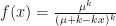

![x \approx exp \left [ \frac{2(1 - \mu)}{\sigma^2} \right ]](https://s0.wp.com/latex.php?latex=x+%5Capprox+exp+%5Cleft+%5B+%5Cfrac%7B2%281+-+%5Cmu%29%7D%7B%5Csigma%5E2%7D+%5Cright+%5D&bg=ffffff&fg=111111&s=0&c=20201002)
 we get:
![y = 1 - x \approx 1 - exp \left [\frac{-2s}{1 + s} \right ] = 2s - 4s^2 + \frac{22s^3}{3} \ldots](https://s0.wp.com/latex.php?latex=y+%3D+1+-+x+%5Capprox+1+-+exp+%5Cleft+%5B%5Cfrac%7B-2s%7D%7B1+%2B+s%7D+%5Cright+%5D+%3D+2s+-+4s%5E2+%2B+%5Cfrac%7B22s%5E3%7D%7B3%7D+%5Cldots&bg=ffffff&fg=111111&s=0&c=20201002)
![y = 1 - x \approx 1 - exp \left [\frac{-2s}{1 + 1/k + s + 2s/k + s^2/k}\right ]](https://s0.wp.com/latex.php?latex=y+%3D+1+-+x+%5Capprox+1+-+exp+%5Cleft+%5B%5Cfrac%7B-2s%7D%7B1+%2B+1%2Fk+%2B+s+%2B+2s%2Fk+%2B+s%5E2%2Fk%7D%5Cright+%5D&bg=ffffff&fg=111111&s=0&c=20201002)
![y \approx 1 - exp \left [\frac{-2s}{1 + 1/k + s + 2s/k}\right] = \frac{2s}{1 + 1/k} - \frac{4s^2}{1 + 1/k} \ldots](https://s0.wp.com/latex.php?latex=y+%5Capprox+1+-+exp+%5Cleft+%5B%5Cfrac%7B-2s%7D%7B1+%2B+1%2Fk+%2B+s+%2B+2s%2Fk%7D%5Cright%5D+%3D+%5Cfrac%7B2s%7D%7B1+%2B+1%2Fk%7D+-+%5Cfrac%7B4s%5E2%7D%7B1+%2B+1%2Fk%7D+%5Cldots&bg=ffffff&fg=111111&s=0&c=20201002)
 .
. 
 , which gives the mean new infections per infection.
 , which describes the variance in new infections per infection.
 .
. and
and  , we get
  and
and  . Any single new infected traveler has just over a 1% chance of seeding a new outbreak, and you’d need ~50 to have even odds of getting a new outbreak.
 acts as a multiplier on the growth rate. We have
 and
and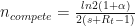 .
. only drops the population 10-fold.


 ), which many simple models haven’t done. Panmixia isn’t accurate, and likely overestimates the speed of the epidemic, especially when the modeling is done on the scale of the whole country. And death rates are likely more accurate than case numbers, due to limited testing.
  . Even if controls are effective at bringing the growth rate negative, there is no reason why the deceleration can’t be much slower than the initial growth rate (e.g., if


